Welcome to the Data Visualization LibGuide!
The main goal of data visualization is to meaningfully communicate information by collecting data, organizing data, cleaning data (eliminating redundancies or errors) and using that data to visualize an idea or important concept. Creating compelling data vizs can also help you view your data objectively and identify trends and outliers as well as lead to data discoveries.
Check out this guide in order to see examples of data vizs, gain an introduction into data visualization and learn more about creating charts and graphs for data vizs. The last tab of this guide also contains all the Data Viz Workshop instructions, exercises and examples of completed data vizs.
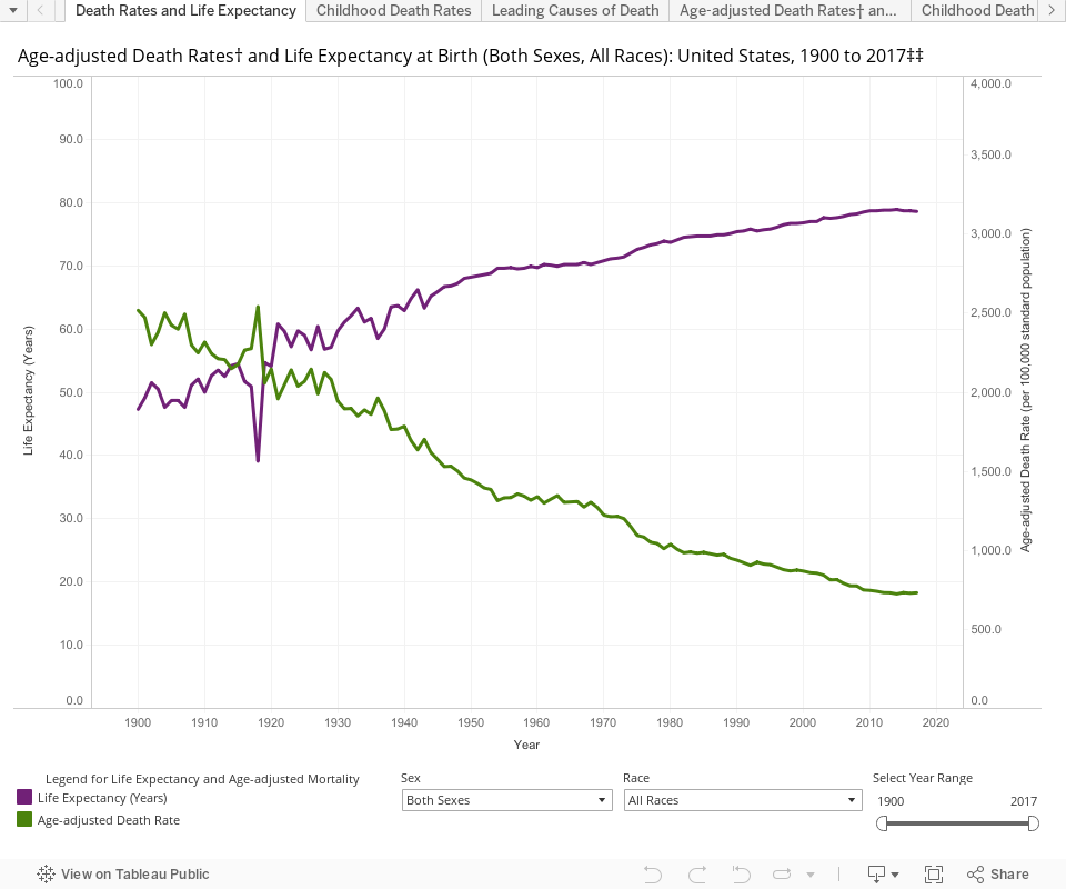
Bastian B, Tejada Vera B, Arias E, et al. Mortality trends in the United States, 1900–2017. National Center for Health Statistics. 2019.
Designed by Bastian B, Lipphardt A, Keralis JM, Lu L, and Chong Y: National Center for Health Statistics.
Good data visualizations are both visually striking, full of information, and easy to interpret and understand. Though a good viz might look simple, they almost always take quite a bit of work to create, starting with the element that might appear simplest: the data! Sure, you can just download a random big, interesting datasets from data.gov on any subject, but how do you clean and curate that dataset, and how do you choose what visualization type to use? And what are you trying to communicate in the first place?
Question
The first step to making a data visualization doesn't necessarily involve any data, but instead with the question you're going to try to use the visualization to answer (though a familiarity with your dataset might prompt a good question). Do you want to look at incidences of lung cancer among residents of one town versus another over the course of a decade? Do you want to show which hospitals have the best outcomes for whipple surgery among patients aged 40-55? This question will inform what kind of dataset you look for (unless you already have one in mind), how you curate that dataset, and what tools you use to create your visualization. So, what's your data question?
Data Sources
You may be doing research that generates data to visualize, but if not, you'll need to find some good data sources. You can see a list of them at the Data Sources tab.
![]()
![]()
![]()
